I've hit a point in creating that I wanted to look at what I have done in the past to see which pieces I have liked enough to go back and fix or update. You learn new tricks or interesting techniques and I feel these previously released pieces might have turned out a little different if I knew then what I know now.
Things like the batter bowl from the
Salt is the Fifth Food Group set . . . it's cute - in fact, I have to say it's pretty darn good for where I was at in my meshing skills at the time of its inception, but the handle has well over double the necessary polys . . . it was also intended to hold something but at the time I had no idea how to do that. Well - now I do and so, I've remeshed the handle to lower the poly count so we can raise it right back up again with things for inside the bowl . . . things like lemons or tomatoes . . . having a slot inside the bowl allows one to place pretty much anything inside it - not just these five new fruits and vegetables. Old poly count just under 1500, new poly count just over 1000. **I also need to add that my understanding of smoothing groups has jumped tenfold so this actually looks nicer. It was completely remapped too so this looks
quite a bit better.
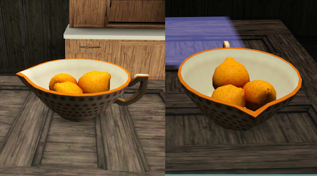 |
| New handle and slot to make this object finally as it was envisioned |
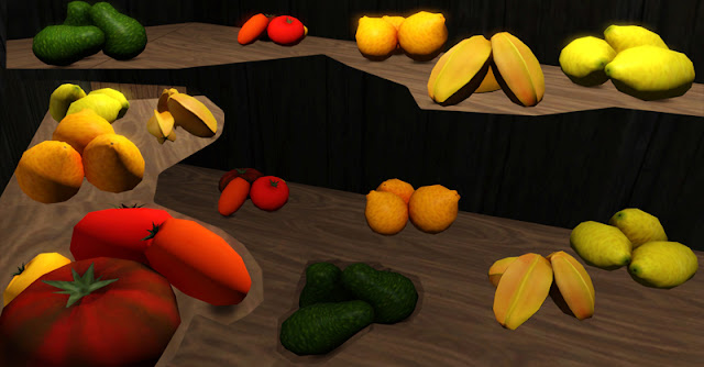 |
| Five new fruits and vegetables to go into the slot (sorry for the sloppy merge of photos at different angles) |
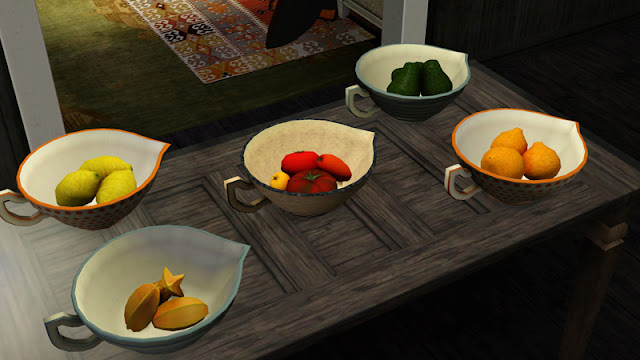 |
| Comes with three styles at different tiling scales - here seen with fruits |
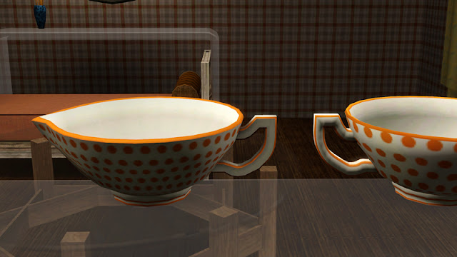 |
| 'New' bowl to the left - resmoothed (properly) and the new handle. |
Speaking of the
Salt set . . . the water glass. While I loved it originally, I have grown to hate it. I don't like it any more upon working with it more. Accursed thing. I was requested to fill it with something. I could do that sure - but I wanted for it to look real - like a bit transparent. I'd have to go through the archives to see if I mentioned the excessive head banging I did working on the edison bulbs, but there is a problem with how the game renders transparency. You can have two transparent items - adding a third causes some problems. Well - let me rephrase this. Adding a transparency to the multiplier is the problem when working with more than two transparent items. I think (
think) you can have glass ad nauseum, but if you want glass, recolorable glass AND a transparency of a label over the glass? Fuck you and the horse you rode in on . . . at least - that is what the program whispered in my ear - it
may have been a pick up line - I cannot be too sure - workshop has it's issues. The glass - it drove me nuts that as the camera panned out, the pattern became worse and worse and . . . where did the glass go? Playing hide and seek during my photo shoot is unacceptable! SO. Glass - less 'real' more 'visible' - pattern - it's still a bit glitchy, but that is the nature of Drizzleware (er . . . the orange pattern) and Oh yes - we have juice. Sorry - it's not transparent as I had hoped, but . . . well,
you reason with the game.
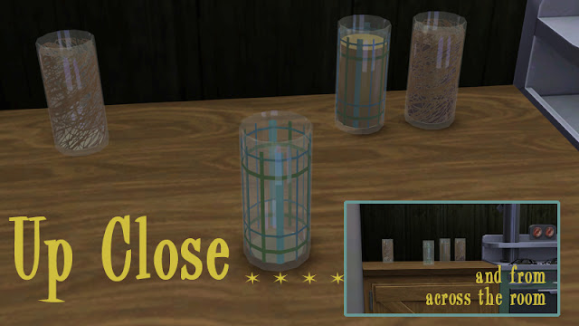 |
| Finally visible and full - all in the same file . . . fancy dancy! |
The
pillow. My first pillow I realized was not going to please everyone. When I went to work with it myself in game, I was so annoyed with the fact that you A: needed a cheat to place it, and B: it hovered above some chairs and sofas - worse - it could
never be placed on the floor. I released a second version of the pillow that sat on the floor, but that still left the hell we know as OMSP. One More Slot Please. Or as I like to call them - OMGH - One More Grey Hair. Heidi showed me a nifty trick of being able to code something like a rug - so no cheats were necessary to place it. The hovering part . . . well - I have tested a number of things and to the best of my ability (currently) my findings are that while I can make it move up and down like a painting no problem, this blocks the ability to allow it to turn around fluidly. It seems the ALT key function can only be back and forth/around OR up/down - it cannot be your everything like
Andy Gibb could. Hell - nothing could hold a
chest hair to him. So after all that - it will still hover curiously over some seating. Sorry bubbies. I tried. **Further update: Even in taking the following photo I realized what a pain in the ass placing these pillows near to each other was going to be without using the cheat. So now all the pillows including the floor style in two sizes (not shown) will be recoded to not need a cheat. Why I hate the cheat - it's a necessary evil - but when you are setting up a screen shot, if you need it active, you cannot place doors and windows. Annoying to turn it on and off, on and off over and over again. My mind simply does not work that way.
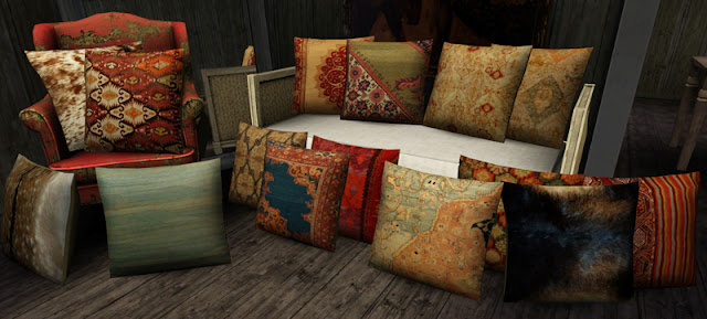 |
15 new styles that go on the two different meshes - including simulated fur
(no animals were thought about being harmed in their creation
[you know I am an animal lover, not a fighter
{Laika! Git'da squirrels! Git'em!}]) |
Pretty much all the 4x3 rugs that have been released (since CB2 series one) will be re-released as a 2x3 as well. That's six (6) rugs. Sadly, with image sizes and quality, rugs released before this mesh cannot be remade entirely. Some images are higher quality while others were a stretch to get on the old meshes used. It's sad, but the clarity of those rugs I have always disliked in game and I hate to abandon them, but it's been a year or more since I collected those images and it's hard to locate them again on the off chance that they can be found larger . . . . that's like finding a grain of sugar in the salt shaker. The most recent small oriental rug had small images as well so they cannot be also made large.
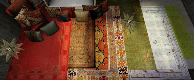 |
| Six resized rug sets in antique, blue, green, kilim and CB-tastic flavors |
I am also planning on filling another request . . . the
shadow box/acrylic box sets came with a light attached and while the art is pretty modern, the light fixture I think gets in the way. I am not sure if it's physically in the way or stylistically . . . regardless. This will be recompiled without the actual fixture but the light intact. If the light is not present then the glass glare is very strong and hard to see what is inside the frame. While I enjoy that sort of realism in my own game, the art really suffers - I could be putting
Thomas Kinkade painting in there at that point. Muahahahah - there's a thought. Painter of light my fucking ass. That man should be shot for crimes against innocent retinas everywhere. Oh the humanity! I am still looking though my files to see if either one of these paintings will see a Series 2, at the moment it is not looking like they will.
One of the last things that I would love to redo is the
male nude set. This was one of the first recolors I did and I always promised a female nude set to follow. One of the reasons it never came to light is that it is rather difficult to find a diverse selection of female nudes that are serious art. While I am still not sure
why that is exactly - the female nude is far more popular a subject for artists - every search for pictures would pull up either the exact same artists every time OR would pull drawings that would more be considered pornographic in nature - not fine art. While there are arguments that all nudity could be considered pornographic in nature, I think one can usually tell the difference (quickly) by the placement of the hands. Generally speaking, in fine art, they are gracefully resting on the leg, for instance, or held away from the body. This is usually not the case for pornographic drawings, and I will let you use your imagination there. While I am still considering how to approach this project again due to the irregular nature of the 'paper' each drawing is on, the original set of 9 seemed small and that frame, while at the time I was thrilled to death with because I was able to do anything different to the existing EA mesh, has always been a rather large distraction to me and seems clumsy when I look at it today. Blocky frame with squiggles upon it never really was my intention. We'll see if I can pull something new off.
Off to get the light off that picture . . . hope I can pull this off before weeks end. Between this, searching for work, and the mortgage song and dance (though, it looks like there is a program that is going to temporarily assist on the state level! Fingers crossed!!) I am not meshing as focused as I could be . . . .


That batter bowl gets so overused in my game, I am literally obsessed with it! Great to see the new version and I admiring that lovely new handle. Is it up for download or have I just completely missed the link?
ReplyDeleteI hope to have all of the above in a post at b5Studio by Friday . . . I sent you an email with details! I am so happy to know that you like that bowl - I am kind of loving it too if I do say so myself!
ReplyDeleteI have just discovered your site and am loving all of the stuff and, of course, the rugs. I feel EA left out oriental especially and you are doing a fantastic job filling in the blanks. I'll have to make due without them for my "custom" rug size :P but truly, thank you.
ReplyDeleteOh, thank you heaven - I seriously need to make some new ones . . . I have some ideas for new sizes, too. I did a challenge at LivingSims for a 10x10 lot and my god - even the 2x3 rug was a real PIA to work with! Way too big! It's just a matter of finding the images in the correct scale!
ReplyDeleteHaha, yes I am discovering that. Typically, I take 2 of the L7 rugs and overlap them some so they are just barely wider than 1 tile. Well, see for yourself here: http://www.modyourpanties.com/hosting/29857_110824112407Rug.jpg. It seriously limits the patterns you can use though. I look forward to seeing what else you come out with.
ReplyDeleteI will absolutely keep this in mind when I am working on a new size - thank you for showing me - I like to have things that people 'can't live without!' :) (I need to add a CASt-able style too for future releases which oddly never occurred to me!)
ReplyDelete